

Table of contents
Media Queries
The most important feature of any website is that it should be responsive. Website should be able to adjust the content based on the screen sizes we can't show same design for every device in the website it will make the user experience bad. The three most commonly used devices to access the websites are Mobiles, Tablets and Computers website should change the design based on the screen size. We can't make 3 different websites for individual devices right? So we use the media queries for the same purpose these are used to give the CSS based on the screen sizes in the same site. By this we make our website responsive based on the devices screen size and make the user experience great.
@media is the keyword used for declaring the necessary CSS in the given screen size
@media screen {
    /* we can give as many classes and id's in this area to provide styling */
}
Media Types
These are given after the @media which determines the device types. On what types of devices is the CSS will be applied is determined by the media types . There are some mostly used media types those are all, screen , print .
all means the media features will be applied on all the devices it is default type if we do not mention the media type.
@media all  {
    .container{
        /* styles */
    }
}
screen this is used for mobiles , tablets and computer.
@media screen  {
    .container{
        /* styles */
    }
}
print this is used for the printers.
@media print  {
    .container{
        /* styles */
    }
}
Logical operators
Apart from the above media types some conditionals are used as only , not , and , , for providing additional information based on the conditions.
@media only screen and (min-width: 600px) {
    /* styles */
}
@media screen, print {
  body {
  }
}
Device Breakpoints
These are used to mention the device minimum and maximum width on which you want to apply the CSS styling.
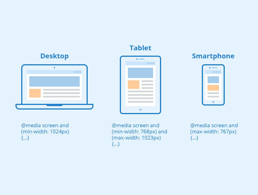
min-width: 600px; This property is used to give the minimum width from where the given styling should start applying. Only from this width the given styling will be applied.
@media (min-width: 768px) {
    .container{
    /* styles */
    }
}
max-width: 900px; This property is used to give the maximum width up to where the given styling should be applied. After crossing the range then the all of the styling mentioned in this query will be removed.
@media (max-width: 1180px) {
    .container{
    /* styles */
    }
}
We can use both the properties using the conditional operators to target the particular size. example is provided below.
@media (min-width: 768px) and (max-width: 768px)  {
    .container{
    /* styles */
    }
}
Apart from these we can also use height , width using conditional operators but it is not recommended.
Based on the device sizes we can set the specific CSS styling and can make the website fully responsive. Remember we can target any element using classes and id's and set the styling specific to the given device sizes.
Thanks for reading...