

Grid Layout
Grid is used to to arrange the HTML elements in desired layout. We can arrange the elements in the columns and rows as we wanted. In CSS flexbox we can only arrange the items in the one dimensional format we don't have much control over the rows and columns it is difficult to align them using the flexbox. But using the grid we can easily control the layout and grid provides alot of functionalities which are difficult to achieve using the flexbox that's what makes CSS Grid most important.
Similar to the CSS flexbox we have two properties for the parent elements and child elements
Properties for Parent Elements
display
This property is used to arrange the items in container in inline or block depending on the value and element. It helps in taking the only space where the content is then using other properties we can set the direction and other properties. This property is set to grid while using CSS grid layout model without this other properties of the grid won't be working.
.container {
    display: grid;
    /* grid properties */
}
Before starting with the grid properties we should understand these important units and functions which are mostly used while using the CSS grid. For the same checkout the Important Units and Functions portion of the article you will get an Idea about them.
grid-template-columns and grid-template-rows
These properties are used to declare the number of grid we want by providing the grid layout width and height by using both column and row templates
grid-template-columns By using this property we can set the width of the each column if we mention the 100px then the column width will be 100px we can use other units as well.
grid-template-columns By using this property we can set the height of the each column. grid height can be set using this property
grid-template-areas
This property is used to set the column and row distribution of the particular column by setting names to the items. After we applying the columns and rows by using the grid-template-area property we will set the area distribution of the rows and columns by setting the names as per the requirement after setting names we simply assign the names to the children items by targeting them and assigning. see the below codepen to see the code and how it is actually working. grid-area is the property which is used to assign the names to children items. more about grid-area is explained in the Properties for the children Elements section of the article.
gap properties
column-gap
This property is used to give the column gap between the grids. It is really easy to understand these properties by using this property we can apply the gap outside the grid.
row-gap
This property is used to give the row gap between the grids. By using this property we can apply the gap outside the grid.
gap
This is the shortcut property for assigning the column and row gaps. By using this we can give the both values to the gap property. checkout the below codepen to see these properties in action.
justify-content and align-content
justify-content is used to align the grids in horizontal direction based on the property values. grids will be arranged in the horizontal.
align-content is used to align the grids in vertical direction based on the property values. grids will be arranged in vertical direction. checkout below codepen to understand all of the property values available in these properties.
justify-items and align-items
justify-items is used to align the content inside the grid in the horizontal direction. Remember this property is different from justify-content.
align-items is used to align the content inside the grid in the vertical direction. Remember this property is different from align-content.
Properties for the Children Elements
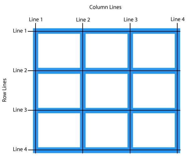
Before starting with these properties we should understand the row and column numbering of the grid layout. See the below picture to get an idea about the grid layout row and column numbering. We can also use negative indexing from the end which starts from end. also remember these are used in children elements.
grid-column-start and grid-column-end
grid-column-start is to specify the start index or column number of the grid from where the grid area distribution should start.
grid-column-end is to specify the end index or column number of the grid to where the grid area distribution should end.
grid-column This is the shortcut Property to specify the start and end index or column numbers for the given children element.
.item1{
    grid-column-start: 1;
    grid-column-end: 3;
/*  above code output will be same as the below code snippet */
    grid-column: 1 / 3;
}
grid-row-start and grid-row-end
grid-row-start is to specify the start index or row number of the grid from where the grid area distribution should start.
grid-row-end is to specify the end index or row number of the grid to where the grid area distribution should end.
grid-row This is the shortcut Property to specify the start and end index or row numbers for the given children element.
.item3{
    grid-row-start: 2;
    grid-row-end: 4;
/*  above code output will be same as the below code snippet */
    grid-row: 2 / 4;
}
Check the below codepen to see how these properties are working.
grid-area
grid-area is used with the combination of the grid-template-areas . This property is used to assign the names to the items in the container based on the assigned names children items distribution area will be changed.
justify-self and align-self
justify-self is used to align the selected item in the horizontal direction in the grid. Remember this is used for children elements based on the values horizontal alignment of the element will be changed based on grid position.
.item1{
    justify-self: center;
    justify-self: stretch;
    justify-self: end;
    justify-self: start;
}
align-self is used to align the selected item in the vertical direction in the grid. Remember this is used for children elements based on the values vertical alignment of the element will be changed based on the grid position.
.item2{
    align-self: flex-end;
    align-self: flex-start;
    align-self: center;
    align-self: stretch;
}
These two properties are used to align items relative to it's grid position.
order
This property is used to give order to the items in the container default will be 0 for every children items based on the numbering arrangement of the items will be changed. We can use negative and and positive values to the order property.
.item4{
    order: 2;
}
Important Units and Functions
fr units
This is the fractional unit which takes the portion of the available space means when we mention 1fr it means it will take 1 portion of the available space it depends on the total fractions if there is only 1 fraction than total available space (100%) is taken if there are 4 fractions than each fraction takes 25% of available space.
.container{
    display: grid;
    grid-template-columns: 1fr 1fr 1fr;
    grid-template-rows: 1fr 1fr 1fr;
}
repeat() and minmax()
repeat() this function is used when we want same to apply same size for multiple rows or columns in the parenthesis we can pass two values first one is the number of repeated rows or columns sizes we want and the second one is the size we can use fr , px or % as the units.
.container{
    display: grid;
    grid-template-columns: 1fr 1fr 1fr;
    grid-template-rows: 1fr 1fr 1fr;
}
/* above code output will be same as the below code */
.container{
    display: grid;
    grid-template-columns: repeat(3,1fr);
    grid-template-rows: repeat(3,1fr);
}
Thanks for reading...